
ABOUT
About CI
CI
ReNA’s logotype utilizes clean and impactful vermilion typography to represent the brand’s bright and energetic identity.
Its distinctive type design combines a modern aesthetic with a friendly tone, intuitively reflecting the essence of the ReNA brand.

CI Guidelines
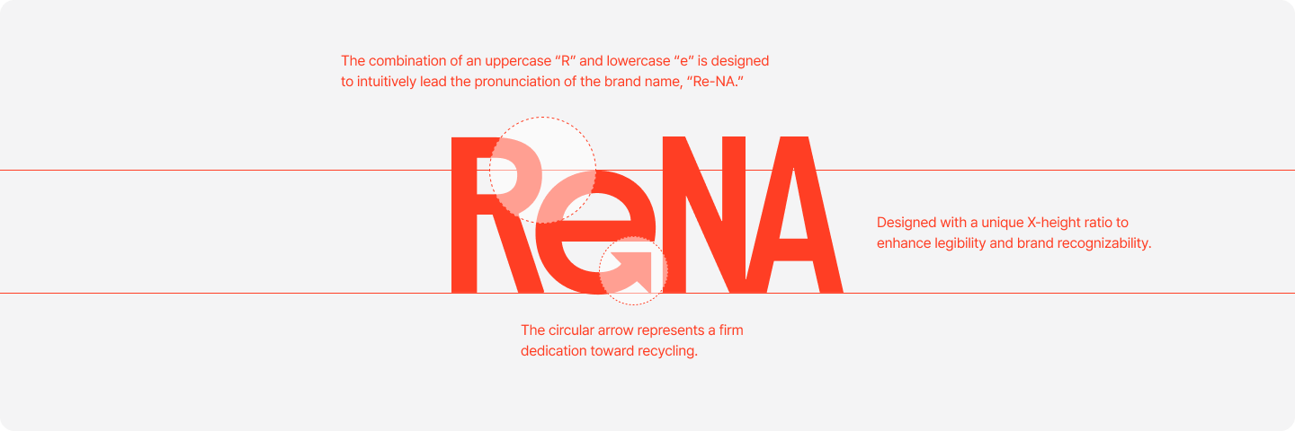
ReNA is built on a brand mission to help keep the Earth clean, delivering a strong message toward a sustainable future. The logo combines a capital “R” and a lowercase “e” to naturally guide the pronunciation of “Re-na,” while the arrow detail within the “e” symbolizes a strong commitment to advanced recycling.
It is designed to maintain clarity in digital environments and offers flexible usability across various media platforms.
Clear Space Guidelines
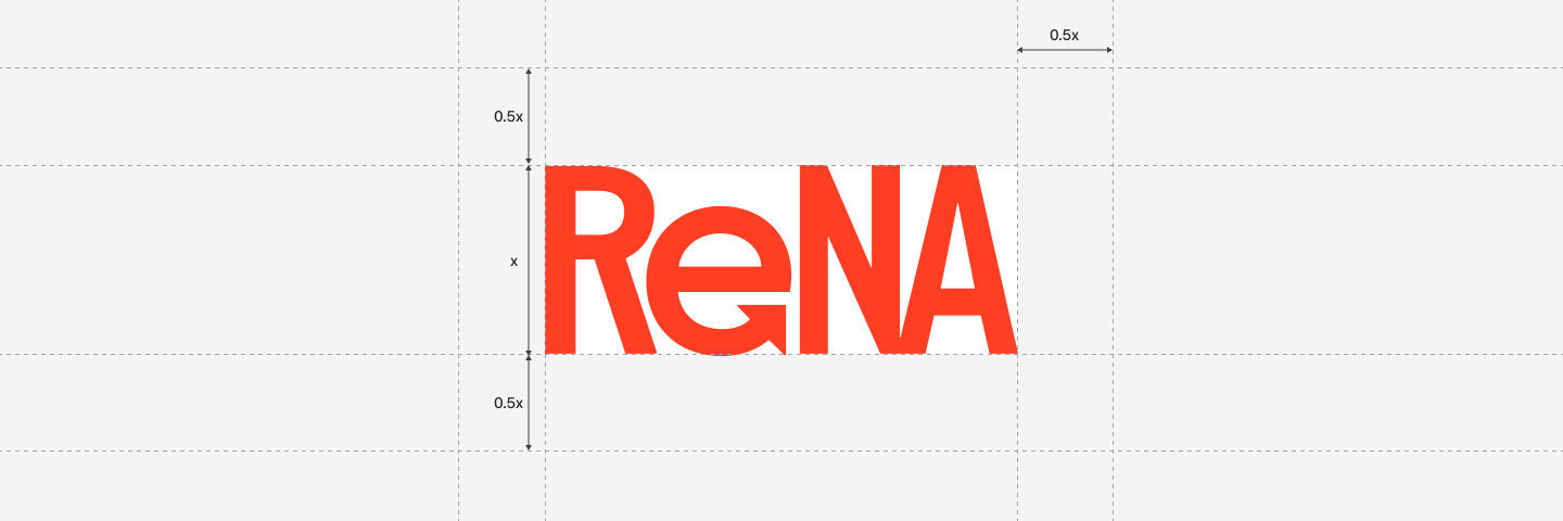
Clear space is the minimum area that must be maintained around the logo to preserve its visual independence and legibility. A margin of 0.5x (where X is the height of the logo) should be secured on all sides to prevent interference or visual clutter from surrounding elements. This space is a protected zone that must remain free of text, images, or graphic components, and should always be respected whether the logo is used on its own or alongside other design elements.
Brand Color Palette
As a global company dedicated to restoring the relationship between people and nature, ReNA expresses harmony through its signature red-orange color—symbolizing warmth and vitality. A gray-khaki sub color is used to support and enhance the visibility of the primary color. To ensure color accuracy and consistency, CMYK values are used for print, while RGB and HEX values are applied for digital media.
Rena Red Orange
#FF3E24
R255 G62 B36
Rena White
#FFFFFF
R255 R255 R255
Rena Gray 01
#FF3E24
R255 G62 B36
Rena Gray 02
#808080
R128 G128 B128
Rena Gray 03
#333333
R51 G51 B51
Rena Gray 04
#000000
R0 G0 B0